LivNao
LIVNAO TECHNOLOGIES
Overview
I was brought onto the LivNao team as the sole product designer and tasked to lead the design for their core mobile app. I dove into the mobile mental health world to help identify how to best address the future of mental wellness through the lens of LivNao.
I was brought onto the LivNao team as the sole product designer and tasked to lead the design for their core mobile app. I dove into the mobile mental health world to help identify how to best address the future of mental wellness through the lens of LivNao.
Project Details
Roles: Research, Ideation, Testing, Prototyping
Roles: Research, Ideation, Testing, Prototyping
Tools: Adobe XD, Figma, Illustrator, Microsoft Survey
Tools: Adobe XD, Figma, Illustrator, Microsoft Survey
THE PROBLEM
DESIGNING FOR CONFIDENCE & CONTROL
Most mental wellness apps today require constant participation from their users and fall short in providing them with ways to track and measure their mental health progress. Not only is this a difficult approach for those with busy schedules in the workplace, it fails to provide a sense of confidence and control for a lot of its users.
DESIGN CHALLENGE
How might we reduce user workload while creating confidence when it comes to digital mental health?
HOW MIGHT WE REDUCE USER WORKLOAD WHILE CREATING CONFIDENCE WHEN IT COMES TO DIGITAL MENTAL HEALTH?
THE UNDERSTANDING AND DEFINITION
USER & MARKET RESEARCH
User Surveys and Focus Groups
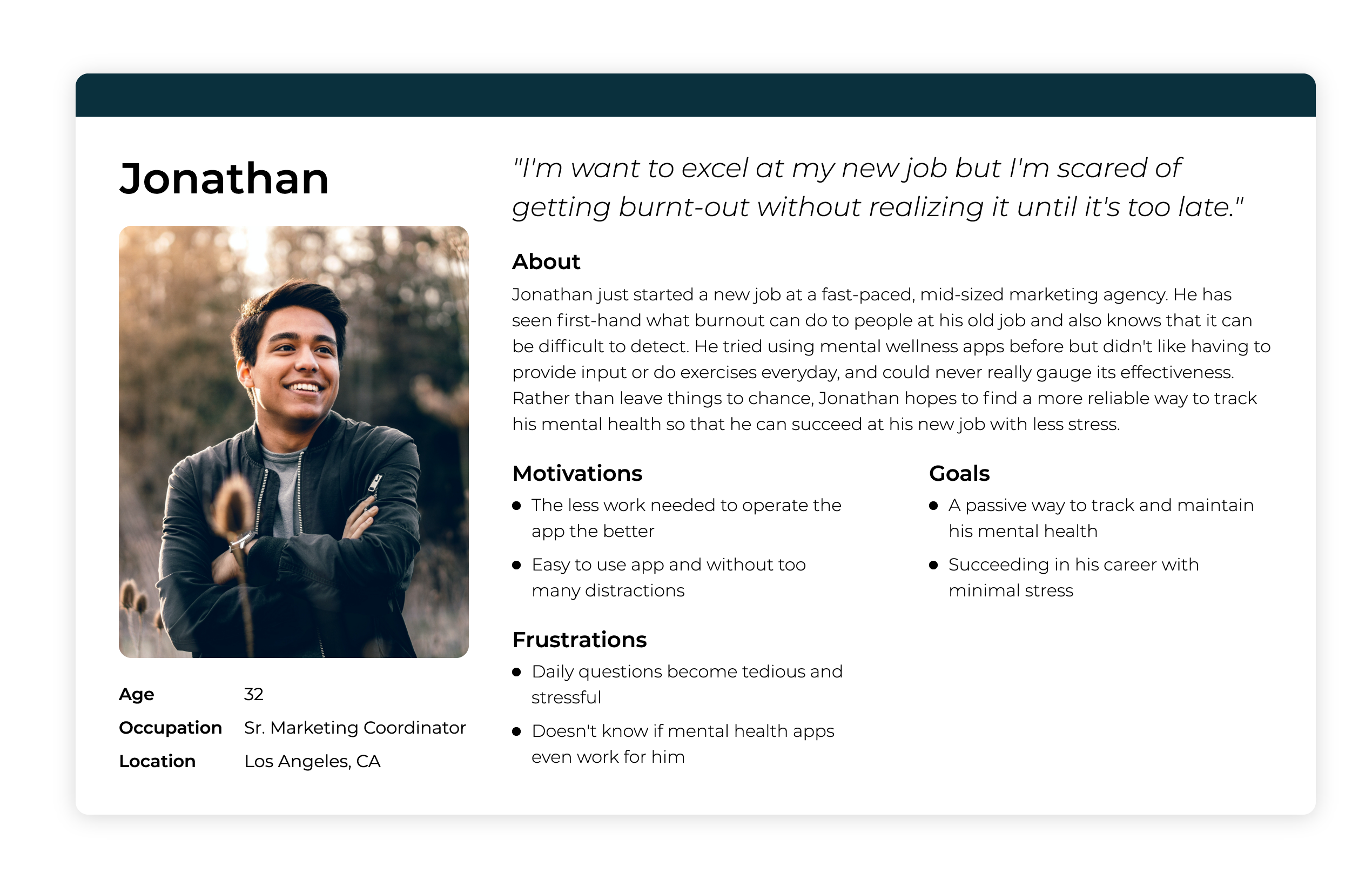
Prior to my joining the team, LivNao had conducted an electronic survey of 215 enterprise employees, as well as a focus groups with 12 full-time employees from varying industries. The goal of this research was to gather insight on their behaviors and pain-points with competing mobile mental health apps. This data, in combination with additional table research, helped define the persona that would act as a reference for our design decisions.
Prior to joining the team, LivNao had conducted an electronic survey of 215 enterprise employees, as well as a focus groups with 12 full-time employees from varying industries. The goal of this research was to gather insight on their behaviors and pain-points with competing mobile mental health apps. This data, in combination with additional table research, helped define the persona that would act as a reference for our design decisions.
PAIN POINTS
Work vs value uncertainty
Prior to joining the team, LivNao had conducted an electronic survey of 215 enterprise employees, as well as a focus groups with 12 full-time employees from varying industries. The goal of this research was to gather insight on their behaviors and pain-points with competing mobile mental health apps. This data, in combination with additional table research, helped define the persona that would act as a reference for our design decisions.
Users voiced their displeasure with having to provide daily input and not enough feedback on their progress.
Prior to joining the team, LivNao had conducted an electronic survey of 215 enterprise employees, as well as a focus groups with 12 full-time employees from varying industries. The goal of this research was to gather insight on their behaviors and pain-points with competing mobile mental health apps. This data, in combination with additional table research, helped define the persona that would act as a reference for our design decisions.
Poor value reassurance
Prior to joining the team, LivNao had conducted an electronic survey of 215 enterprise employees, as well as a focus groups with 12 full-time employees from varying industries. The goal of this research was to gather insight on their behaviors and pain-points with competing mobile mental health apps. This data, in combination with additional table research, helped define the persona that would act as a reference for our design decisions.
The apps fails to provide consistent reasoning when it came to their resolutions.
Prior to joining the team, LivNao had conducted an electronic survey of 215 enterprise employees, as well as a focus groups with 12 full-time employees from varying industries. The goal of this research was to gather insight on their behaviors and pain-points with competing mobile mental health apps. This data, in combination with additional table research, helped define the persona that would act as a reference for our design decisions.
Tedious usage pattern
Prior to joining the team, LivNao had conducted an electronic survey of 215 enterprise employees, as well as a focus groups with 12 full-time employees from varying industries. The goal of this research was to gather insight on their behaviors and pain-points with competing mobile mental health apps. This data, in combination with additional table research, helped define the persona that would act as a reference for our design decisions.
The act of having to take the initiative to go into the app multiple times a day was not a driving motivation for the user.
Prior to joining the team, LivNao had conducted an electronic survey of 215 enterprise employees, as well as a focus groups with 12 full-time employees from varying industries. The goal of this research was to gather insight on their behaviors and pain-points with competing mobile mental health apps. This data, in combination with additional table research, helped define the persona that would act as a reference for our design decisions.
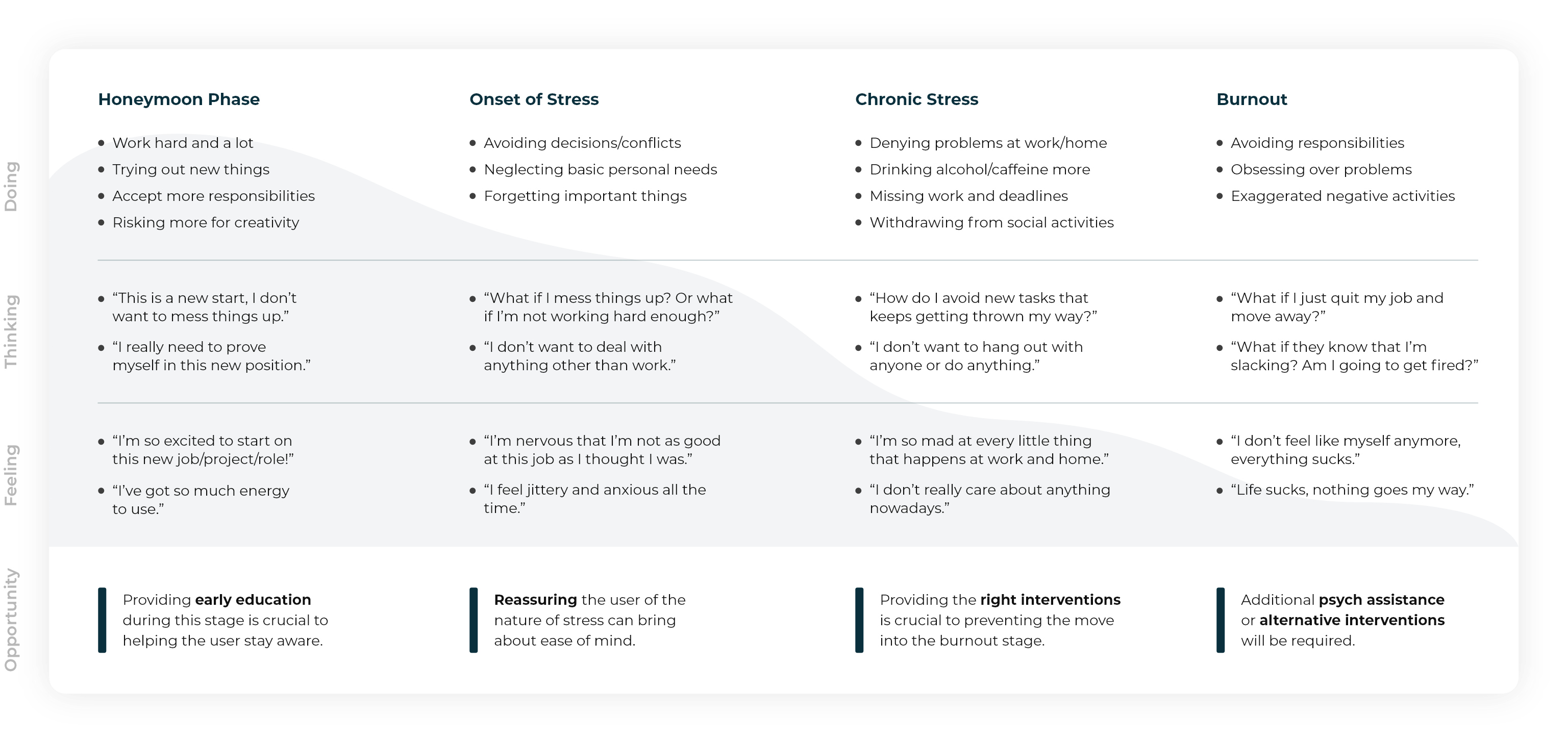
Journey of Burnout
In order to gather a better understanding of how the corporate phenomenon affects, I mapped out the stages of burnout as experienced by an employee starting a new job. This tool helped align the team on the different user behaviors and pain points, and what kind of opportunities might be available within each stage. In addition, it helped me realize that not everyone that uses the app will be starting from the same stage. I then worked closely with our clinical ambassador to adjust and adapt our push notification settings (e.g. frequency, intervention type, content) according to the different stages.
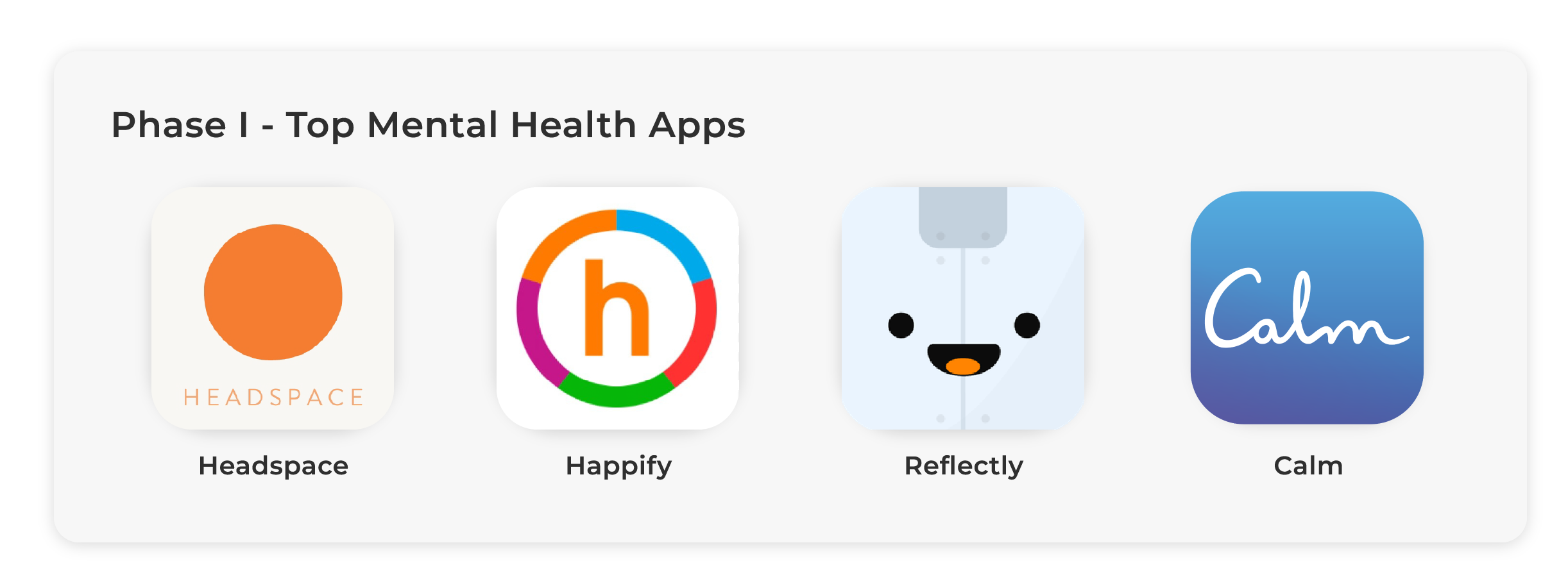
Because our underlying design goals was to break away from the norms of typical mental health apps, our secondary research was broken into two phases.
Phase I focused on identifying the general UX and UI strengths and weaknesses of our direct competitors. I spent this time perusing through countless iOS app reviews, and reviewing the workings of the apps themselves.
Competitive Analysis
Similar to the findings in our user research, the common trend among some of the most popular mental health apps was that they required its users to perform some form of daily input or activity - such as surveys, questionnaires, exercises, or journaling. In addition, the frequency of these inputs seemed to be entirely based around the person's whim or commitment, and not necessarily around their mental health. Lastly, none of the apps provided any tools that helped track or measure a person's actual mental health progress.
Because our underlying design goals was to break away from the norms of typical mental health apps, our secondary research was broken into two phases.
Phase I focused on identifying the general UX and UI strengths and weaknesses of our direct competitors. I spent this time perusing through countless iOS app reviews, and reviewing the workings of the apps themselves.
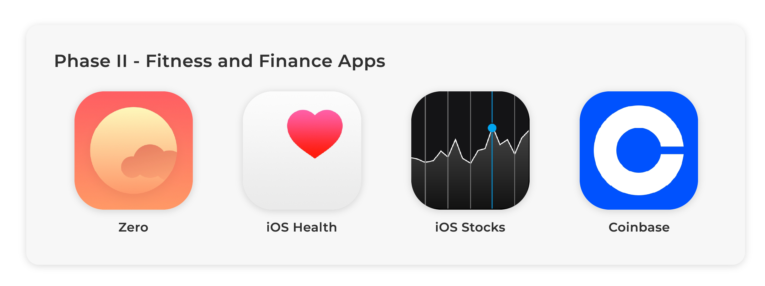
Inspiration Exploration
For this phase I directed my attention to competitor-adjacent apps with components and functions that better suited our technology; all of which focused more on displaying data tracking and measurement as a part of their technological offerings (e.g. health/fitness and finance/stocks). Most of the inspiration that went into our visual design came from these apps.
Phase II re-directed my attention to competitor-adjacent apps with components and functions that better suited our technology; all of which focused more on displaying data tracking and measurement as a part of their technological offerings (e.g. health/fitness and finance/stocks).
THE INSIGHT
"WHAT'S IN IT FOR ME?"
The research uncovered that while most of the surveyed employees had experimented with mental wellness apps in the past two years, only 19% of them reported continual bi-weekly use. Further qualitative data revealed that much of the fall-off in usage was due to the amount of work required to operate the apps on a daily basis; as well as a lack of active feedback regarding user progress. With these insights, I had a basis of what to focus on for the ideation phase.
THE IDEATION
FROM DATA TO DISPLAY
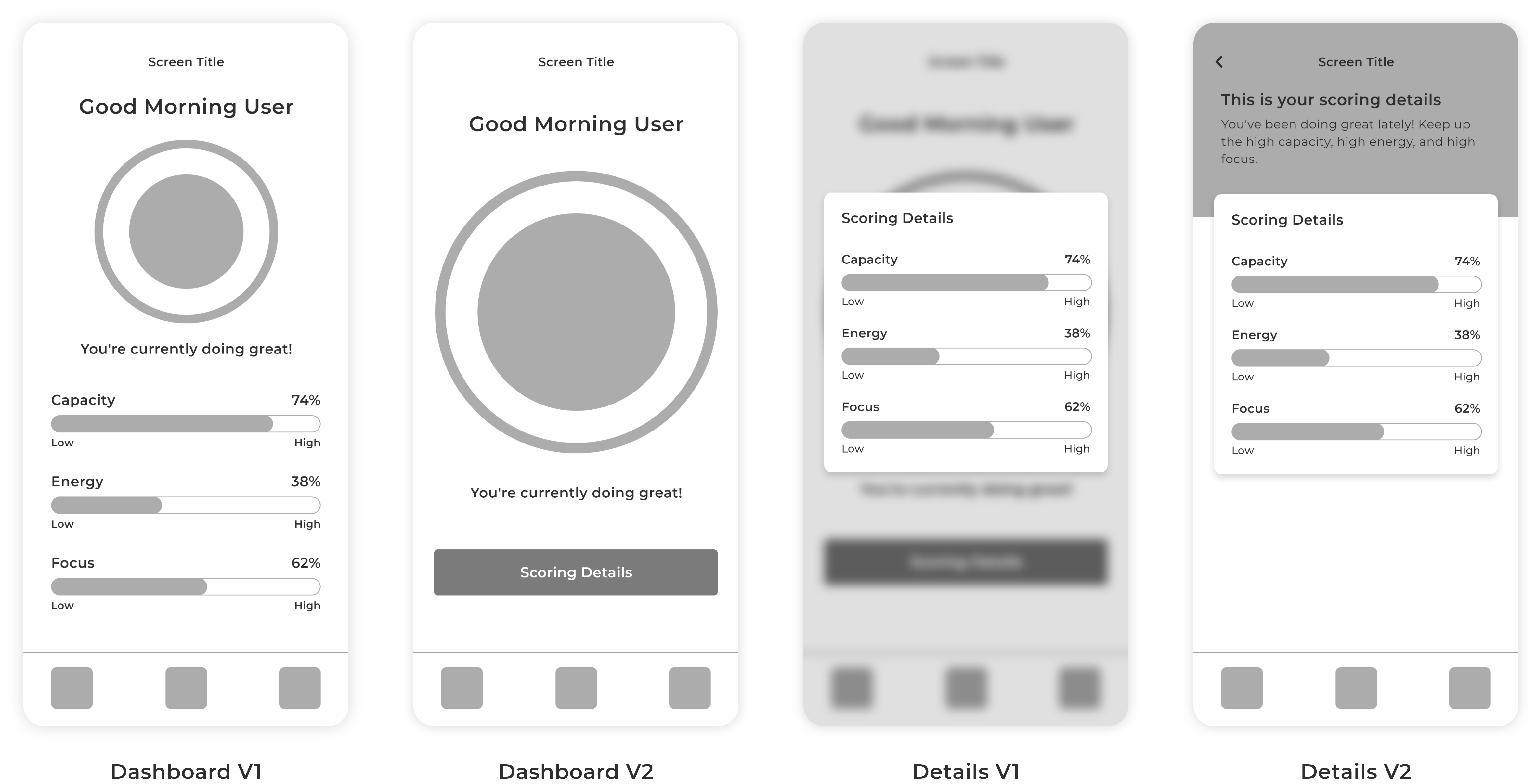
Sketches & Wireframes
The initial sketches were done on Adobe XD. The goal was to dish out as many different ideas as quickly as possible, and then feeding it through the feedback loop with the team to gather critique for further iterations. Below are some of the early iterations that contributed to our final design.
The initial sketches were done on Adobe XD. The idea was to dish out as many different ideas as quickly as possible, and then feeding it through the feedback loop with the team to gather critique for further iterations. Below are early iterations that contributed to our final design.
THE TESTING
NIPPON
For the testing process, we secured a pilot company in Japan to help test our app in a real world setting. It was a one month testing period with 32 total participating employees. At the end of the testing period, we provided an eight question survey with both quantitative and qualitative questions. The main objective was to evaluate function understandability and flow efficiency, while also identifying other areas of possible confusion for further refinement.
For our testing process, we secured a pilot company in Japan to help test our app in a real world setting. It was a one month testing period with 32 total participating employees, and we provided an eight question survey with both quantitative and qualitative questions at the end of the testing period. Our goal was to evaluate and identify possible areas of confusion and/or friction for further refinement.
NOTE - we recognized that this test was being performed in a different cultural setting, and could have an adverse effect on the testing results. We did our best to navigate through this obstacle by receiving consult on how to design the survey to address a Japanese audience.
Revisions - Introducing Novelty Functions
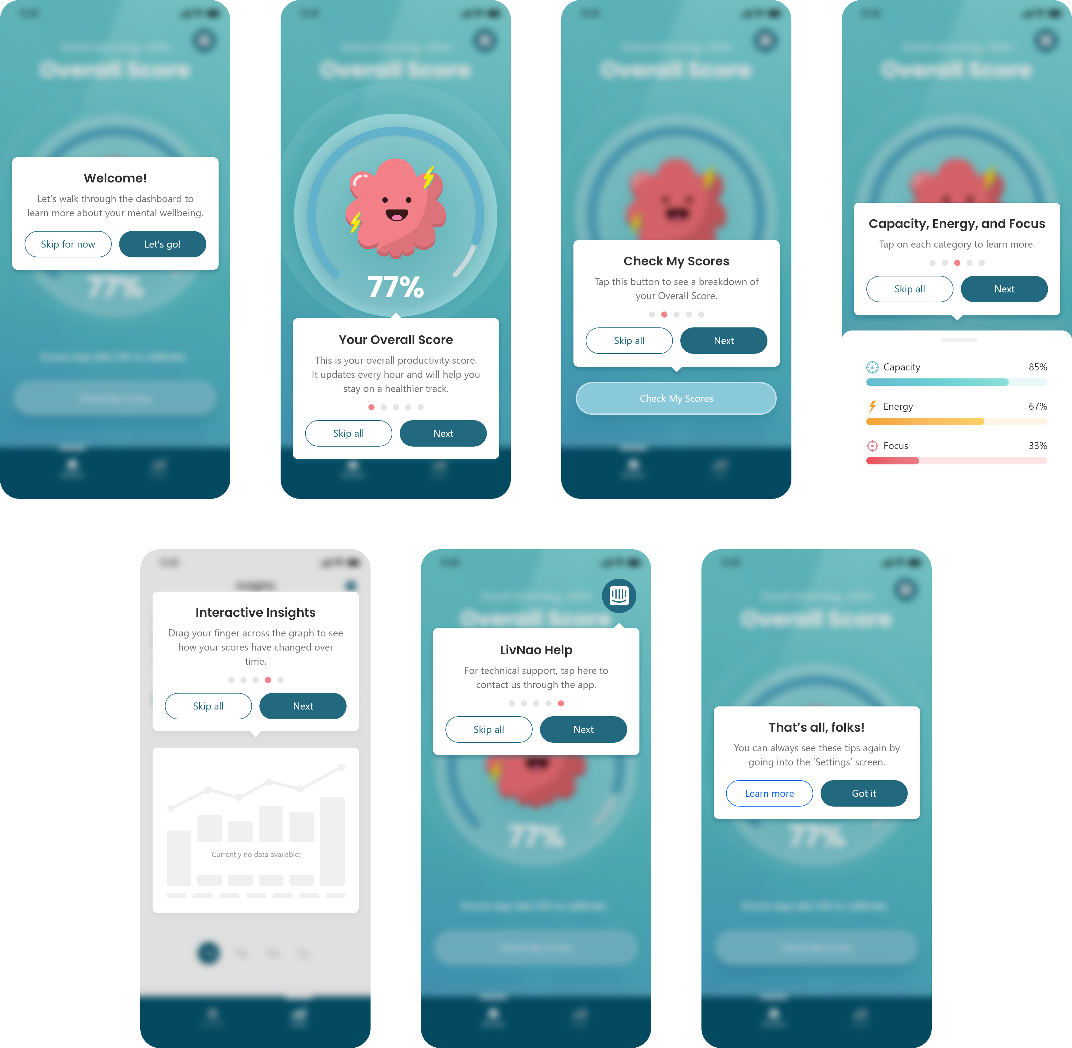
Many of the users revealed their confusion when it came to the app's scoring functionality. I believed this had a lot to do with the overall novelty of the app. To minimize the confusion, I implemented short but detailed blurbs for each of the scoring aspects within the 'score breakdown' menu.
Many of the users revealed their confusion when it came to the app's scoring functionality. We believed this had a lot to do with the overall novelty of the app. To aid in the learnability of the app, we implemented explanations of each of the scores within the 'score breakdown' menu.
In addition, I introduced a product walkthrough to help provide a simple yet straightforward breakdown of the apps main functions. I only targeted the vital functions of the app in order to improve learnability without adding unnecessary noise.
In addition, we introduced a product walkthrough to help provide a simple yet straightforward breakdown of the apps main functions.
THE RESULT
PASSIVE & PREVENTATIVE DIGITAL MENTAL HEALTH
PASSIVE & PREVENTATIVE DIGITAL MENTAL HEALTH
The LivNao app helps enterprise employees track and monitor their mental health status and provide just-in-time intervention push notifications when their status falls below certain levels. All of this is possible through the smartphones sensor data and our AI technology.
The LivNao app helps enterprise employees track and monitor their mental health status and provide just-in-time intervention push notifications when their status falls below certain levels. All of this is possible through the smartphones sensor data and our AI technology.
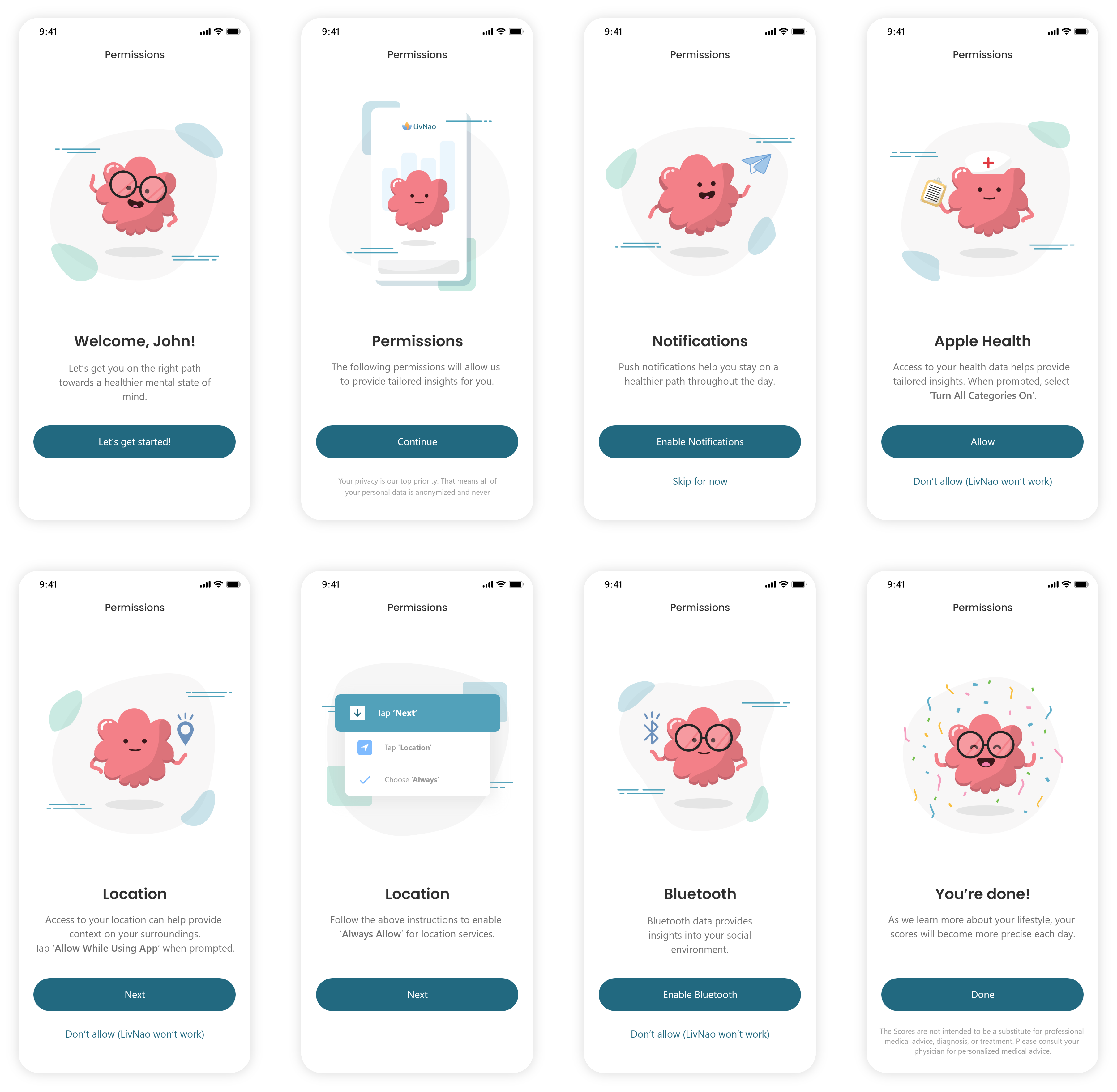
Permissions Onboarding
Right from the get-go, the onboarding flow is intended to help address privacy concerns and provide reassurance. To follow the ethical guildelines we established as a healthcare company, we set out for full transparency and outlined all of the sensor permissions needed in order for the app to function properly.
Right from the get-go, the onboarding flow is intended to help address privacy concerns. We aim for full transparency and outline all of the sensor permissions needed in order for the app to function properly.
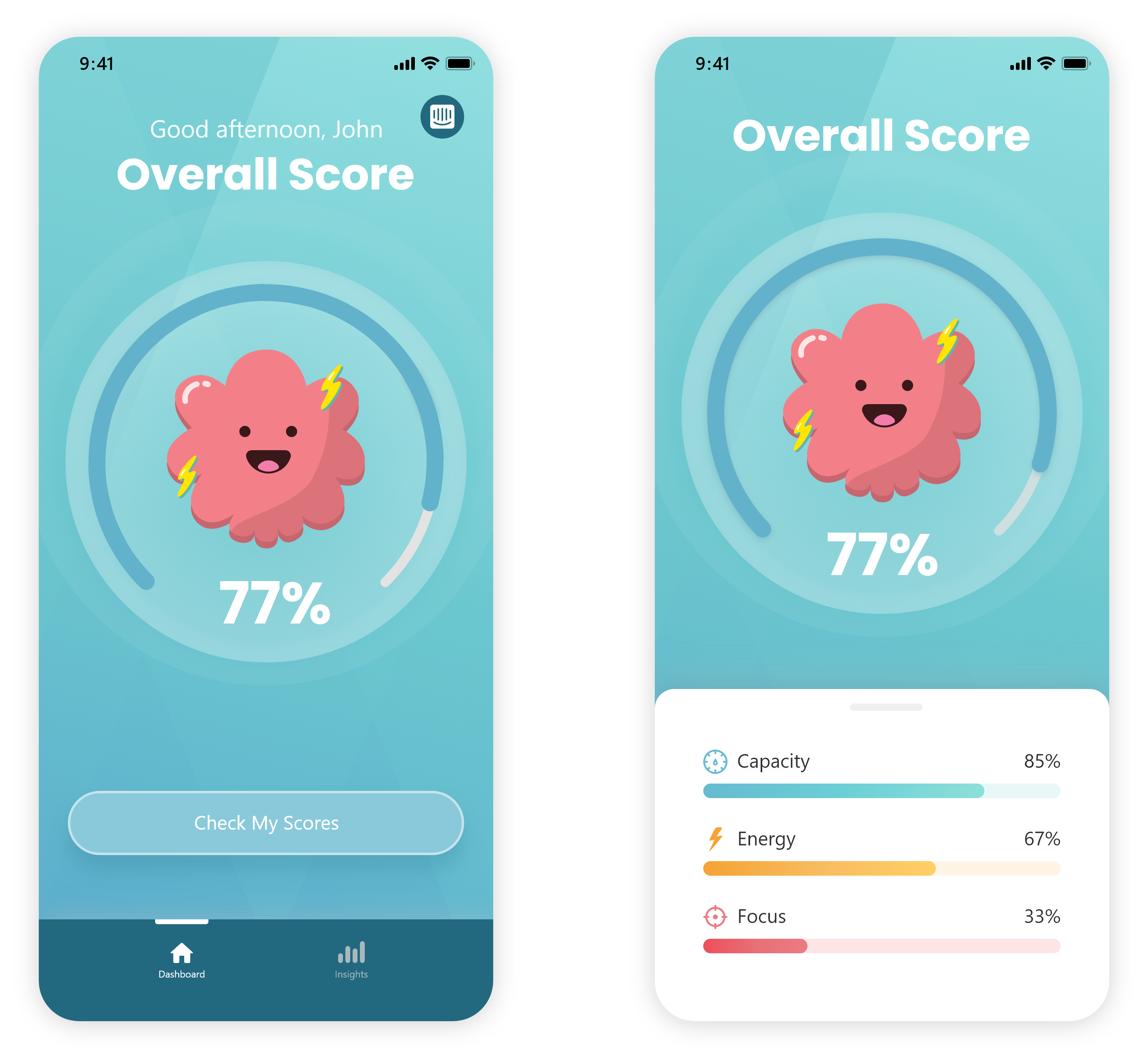
Mental Health Overview
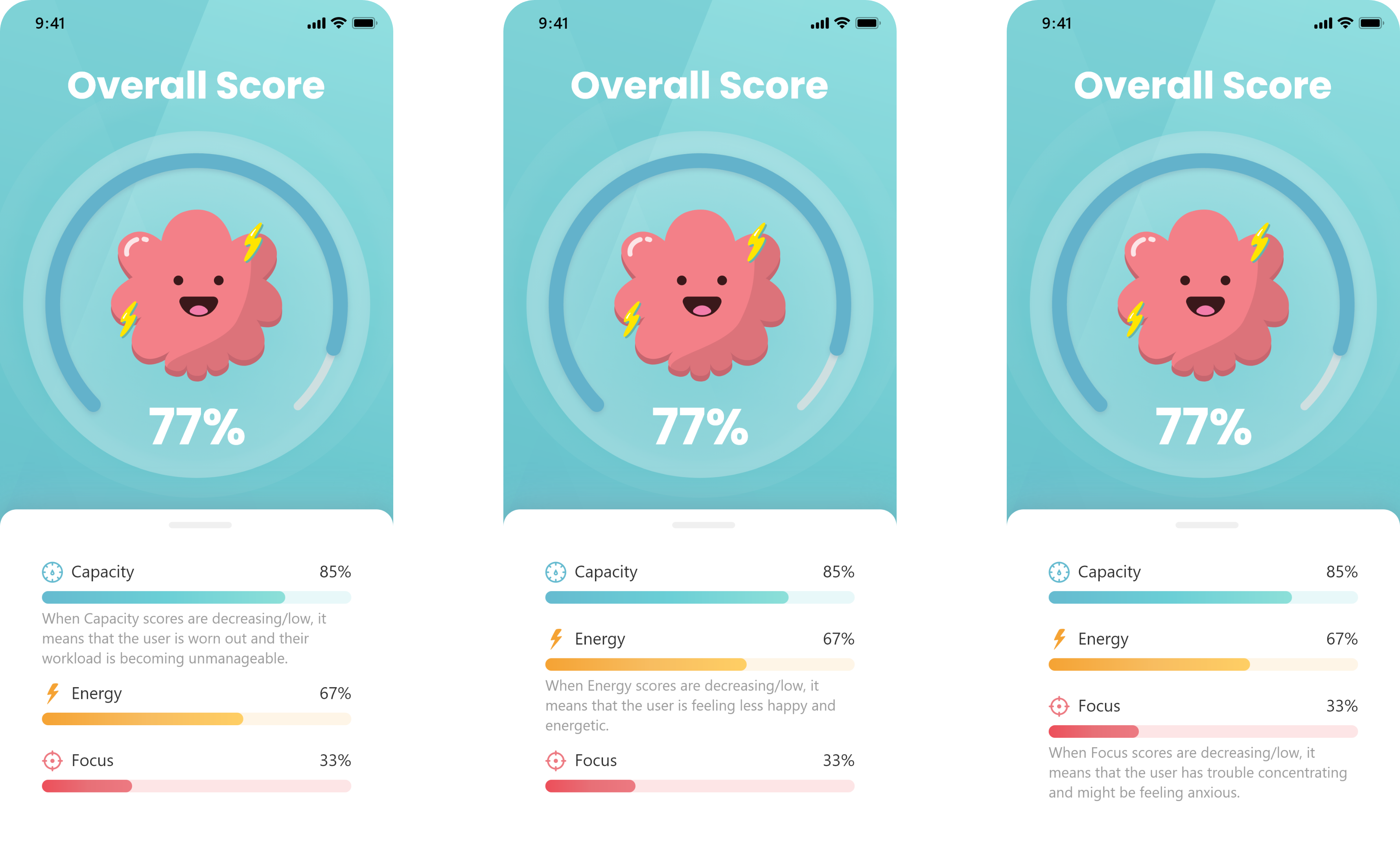
The dashboard features an easy-to-view visualization of the user's mental health status - the primary function of the app. As a mental health brand, we took note from our competitors and sought for a soft and non-stressful app environment. The UI design reflects a relaxed and playful environment as to follow in the workings of the other mental health apps. The underlying goal of this screen to provide just enough information for the user to know and understand their scores, without adding any unnecessary noise.
Keeping true to our primary function of the app, the dashboard features an easy-to-view visualization of the user's mental health status. The underlying purpose being to keep the user informed at any time.
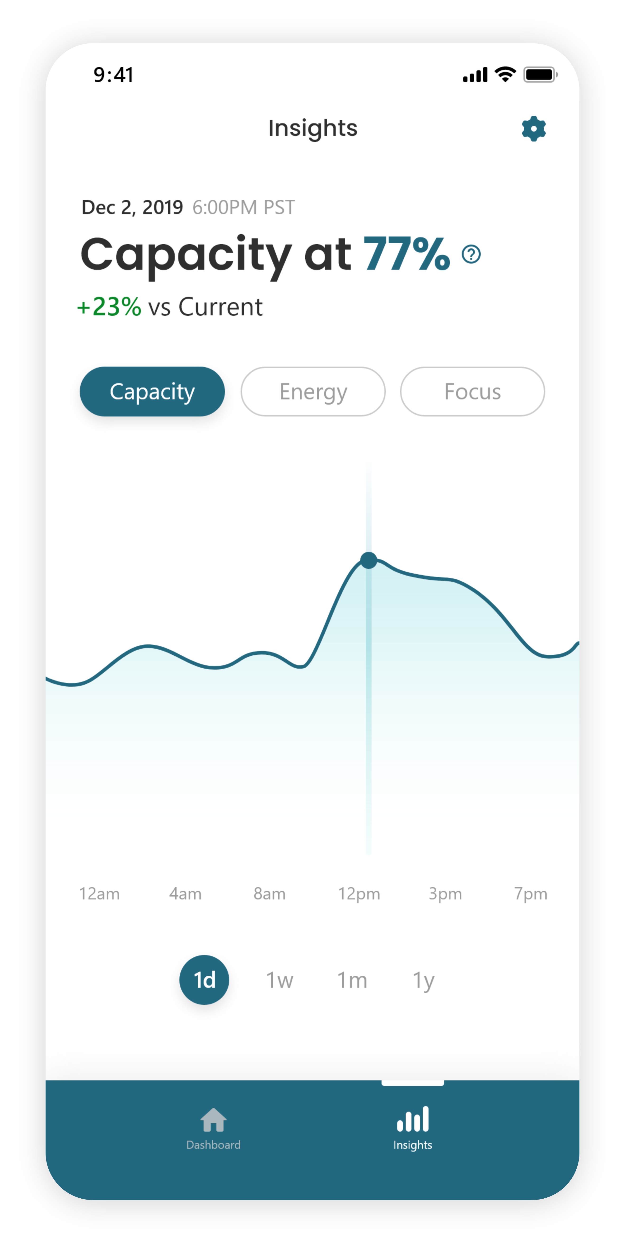
Insights and Progress
Taking notes from the financial and fitness tracking apps, the insights screen was designed to allows users to easily track and compare their current/past mental health scores. In turn, users are given the necessary data to identify trends and patterns instead of trying to guess their progress as they had to with other mental health apps.
Users can track and compare past mental health scores to see how they're progressing over time. In turn, users are given the necessary data to identify trends and patterns instead of trying to guess their progress.
LESSONS LEARNED
LESSONS LEARNED
This was by far one of the biggest and most challenging projects I've had the opportunity to work on. One of the main lessons I took away was the importance of outlining UX strategy early on. Not only does it make it easier to structure each phase of the design process, it also provides team members and stakeholders with better insight of the design objectives and outcomes.
WHAT'S NEXT?
Further privacy concern exploration
Although a few solutions have already been implemented, I believe additional user feedback will provide further insight into how to better address this issue.
Push notification response in high-stress environments
I realized that the way people approach push notification in busy work and home settings can have a massive impact on the effectiveness of our app. We currently have a system in place that regulates the frequency and content of the notifications based on a scale of the person's mental health scores. However, we still need to gather data on exactly how the users are responding to their notifications.