ORIGINAL GRAIN APP
Overview
Original Grain is the premiere watch company specialized in the use of reclaimed wood and steel. Each and every one of their timepieces are masterly handcrafted to tell a unique story. I took on this project to transform their mobile experience to match the same world-class craftsmanship and character showcased by their watches.
Project Details
Roles: UX Design, UI Design
Tools: Adobe XD, SurveyMonkey, Photoshop
Duration: 2 weeks
Design Challenge
How might we optimize the mobile e-commerce experience to fit the needs of the platform and its users?
The Problem
The poor responsiveness of the mobile storefront fails to capitalize on the benefits of a simple yet fluid mobile ecommerce experience.
My Approach
Due to the nature of this project, I kept my approach straightforward and simple:
1. Gain insight on user needs via an online survey
2. Conduct an analysis of the current mobile website
3. Implement design changes to bridge the gap between user needs and current mobile shortcomings.
DISCOVER
Identifying User Needs
Primary Research
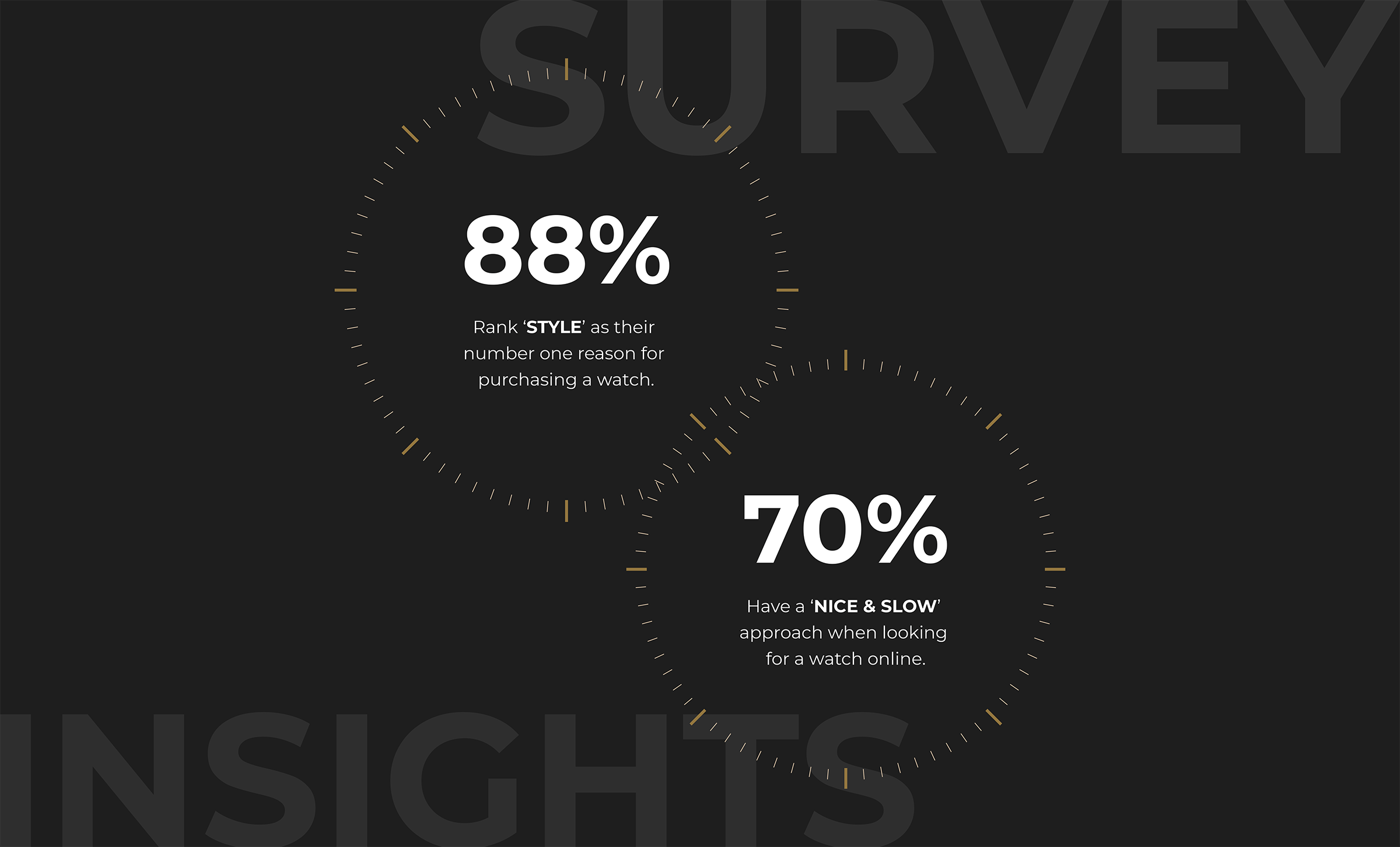
In order to better understand what factors shoppers tend to look for when looking to buy a watch online, I conducted an online survey with 17 total participants. The insights helped guide my decisions when designing for the app's information hierarchy and interface layout.
Secondary Research
One of the driving factors behind the revamp was the knowledge of the growing business opportunities of mobile e-commerce. It is projected that by 2021 mobile ecommerce sales are expected to account for 54% of total ecommerce sales.
In addition, studies show that the buyer conversion rates of apps to be greatly higher than that of mobile web. This can be credited to several reasons including faster load/response times, auto login and instant payment capabilities, and better overall user interfaces.

DEFINITION
Core Problems
Prior to the redesign, the mobile website didn’t necessarily show any major design flaws but still presented numerous opportunities for improvement. My focus was to improve user flow while reducing surrounding noise that negatively impacted the mobile shopping experience.
Pain Points
Slow Responsiveness
The most noticeable and frustrating problem present on the website. Page load times took on average 6-8 seconds to fully load.
Technical Glitches
Several area had technical errors that either negatively impacted user interaction and/or prevented user progress.
Information Overload
This takes away from the overall aesthetics and accessibility of the website with a crowded interface and smaller fonts.
“A one second delay in mobile load times can impact mobile conversions by up to 20%.”
Source: Think with Google
THE APP RE-CRAFTED
A clean and intuitive mobile experience.
Thinking Ahead
Artificial Reality (AR)
One specific and important area that was not covered in the redesign is how to effectively address the fit of the watches. Aside from providing the size specifications of each watch in mm measurements, it's a rather difficult task to physically show how the watch may look on different sized wrists. A possible future solution would be to incorporate artificial reality (AR) technology to map out a person's wrist and displaying the watch via their smartphone. This has already been made possible in the worlds of glasses.